There’s an old-school thrill to a poster pasted on a wall — bold type, clear hierarchy, a graphic that reads at a glance. The Facebook feed is different: small, scrolly, and full of motion. The challenge is simple and delicious: make the poster’s theatrical presence survive a thumb-swipe.
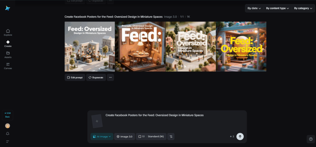
If you want to prototype poster moods quickly, start with an AI photo generator to test lighting, texture, and grain across several mini-crops. AI generators like Dreamina help turn those quick experiments into a coherent set of mobile-first layouts you can ship in an afternoon.
Post Contents
Poster thinking for pocket realities
A poster in the feed has to do two things instantly: stop a thumb, and reward a tap. Treat it like a stage poster shrunk to thumbnail scale.
Design moves that matter in-pocket:
- A single, dominant focal element (face, object, or emblem) that reads at <200px
- Generous negative space so the eye lands without effort
- One strong typographic shout — a single word or short phrase — not a paragraph
For Facebook, think in beats: thumb-stopping frame, quick story hint, clear action. Let the poster be bold, but keep the execution crisp and legible.
Reimagining scale: from billboard gestures to thumbnail whispers
Big posters rely on far-reading tricks: huge type, long sightlines, dramatic imagery. In the feed, replicate the emotional intent rather than the literal scale.
- Translate “huge” into contrast: maximum difference between the focal element and the background
- Uuggest depth with subtle foreground elements that peek into the frame (a hand, a corner of a poster, a prop)
- Use oversized typography as a sculptural element: let a single letter crop across the edge as a compositional anchor
These tactics preserve the poster’s bravado without forcing viewers to zoom.
Composition hacks that read at speed
Mobile viewers skim; design for a glance.
- Lock a grid where the focal point sits at 30% from the top — it’s where eyes naturally land in feeds
- Use color blocking to create quick legibility: a single pop color behind the headline keeps type legible on busy images
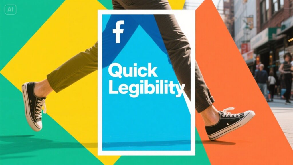
- Embrace bold silhouettes — simple shapes survive compression and small thumbnails
A/B test several crops and pick the one that still “reads” at tiny sizes. Don’t fall in love with full-frame panoramas that become indecipherable thumbnails.
Typography that punches, not whispers
Poster typography often revels in texture and nuance — serif extravagance, textured inks, and intricate ligatures. On Facebook, strips of detail flatten. Choose a type with character but cut away the frills for feed use.
- Pick one display face for headlines, always bold or semi-bold
- Reduce lines to a single short phrase; prefer verbs and nouns over adjectives
- Reserve decorative type for hero images that appear only on desktop or linked landing pages
A single, crisply rendered word can carry more presence than a paragraph of clever copy.
Motion suggestions: subtle choreography, not strobe
The feed moves. You don’t need full video; small motion can give your poster its signature.
- Micro-animations: a slow glow on the headline, a tiny reveal of a product, or a parallax nudge when the card is tapped
- Looping GIFs: short, two- or three-frame loops that echo the poster gesture without becoming a distraction
- Hover or press states: designs that slightly expand on interaction, rewarding curiosity
Use motion as a hierarchy tool — it should guide attention, not compete with the message.
Storytelling in three swipes
If a single frame can’t hold the whole idea, use a carousel as a tiny poster series. Think of it as three connected posters that together make a proclamation.
- Card one: the bold headline and single visual promise
- Card two: the craft or detail that explains the promise
- Card three: the call-to-action or social proof that closes the loop
Carousels let you keep each card minimal while building curiosity across the set.
Brand anchors and logo behavior
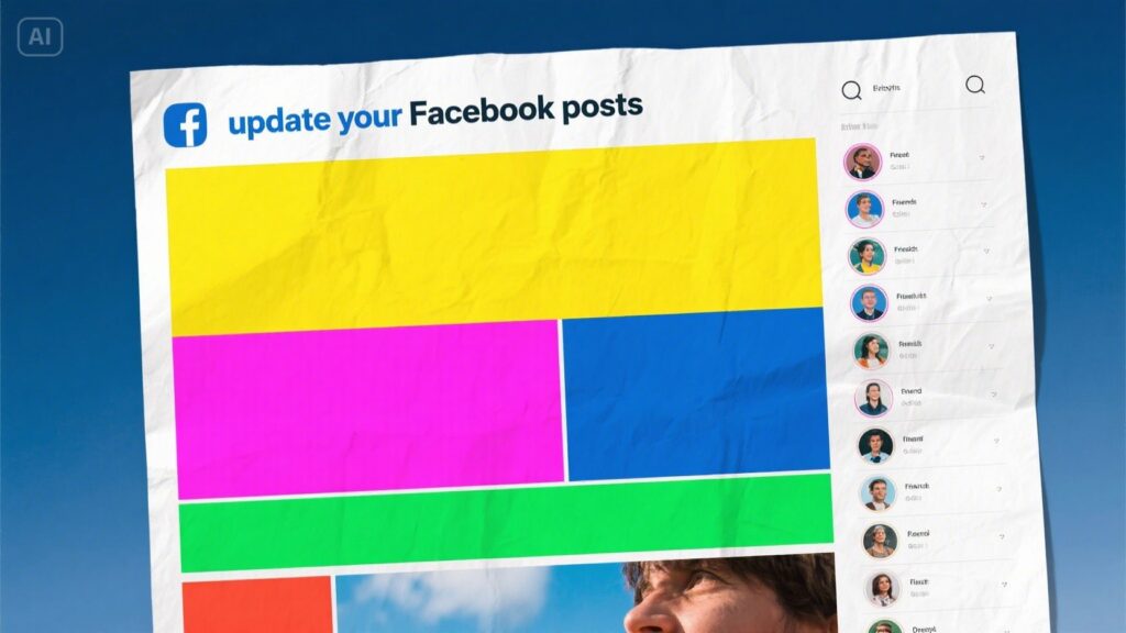
Logos on posters are punctuation — important but quiet. In feed contexts, the logo often competes with app chrome, profile pics, and other badges. Treat the logo as an anchor, not a showpiece.
- Keep a simplified emblem for tiny placements rather than full wordmarks
- Reserve full logotypes for the landing page or the last frame in a carousel
- Ensure contrast and spacing so the emblem survives the platform’s compression
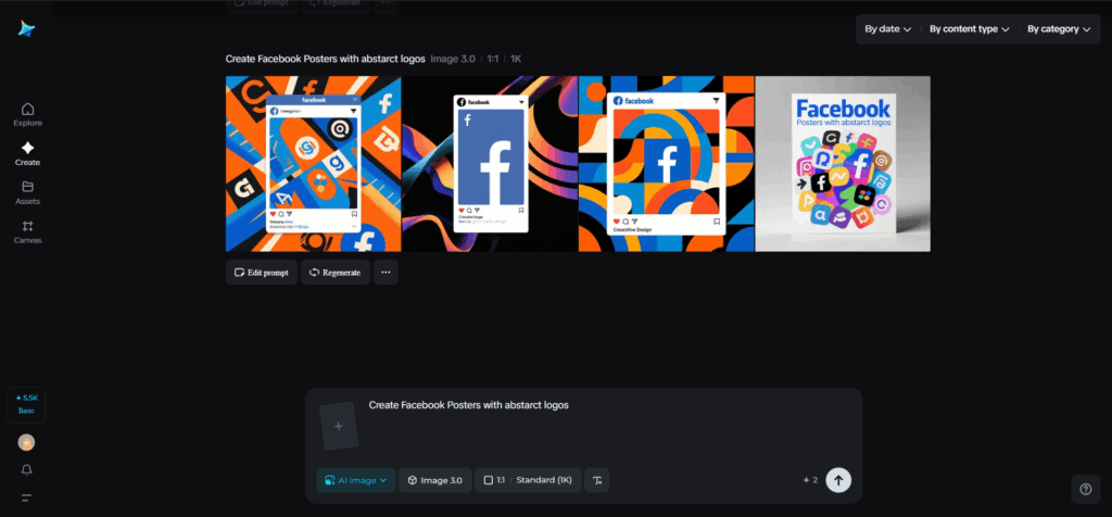
If you’re experimenting with compact mark variants that work with motion or tiny crops, try quick directions in Dreamina’s AI logo generator to produce a set of simplified emblems to test.
Tactile takeaways and IRL amplification
A poster-like campaign can extend beyond pixels. Think about physical tokens that echo the creative system.
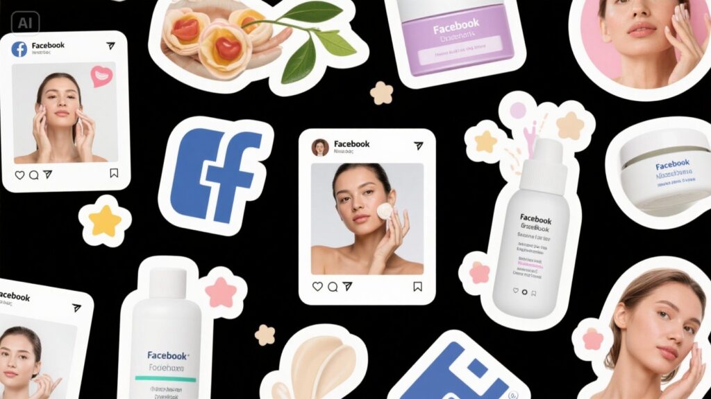
- Peel-and-share stickers handed out at events or with orders reinforce recognition off-screen
- Folded mini-posters or postcard prints act as collectible reminders
- Small merch drops that reproduce the poster motif make the campaign a shareable object
Consider Dreamina’s sticker maker for prototypes—small runs let you test which visuals collectors actually want to stick on laptops and water bottles.
Placement and timing
Never assume pristine viewing conditions. People scroll on buses, in low light, in noisy places.
- Test contrast under low-brightness simulations and in black-and-white to ensure legibility
- Optimize for Facebook’s common aspect ratios; save variants for 1:1 and 4:5 crops
- Schedule posts for times your audience is most likely to pause: evenings, lunch hours, or region-specific commute windows
Accessibility means more people can enjoy your poster without strain; it also increases reach and reaction quality.
Tactical checklist for poster-to-feed production
- Design the focal element to read at phone thumbnail size
- Limit headline to 1–3 words and test in tiny crops
- Create a colored “safe band” for text overlays so copy survives busy backgrounds
- Export at platform-recommended sizes and test on real devices before scheduling
A production checklist keeps the poster’s intent intact when translated to the small screen.
Closing the loop with Dreamina
Dreamina helps you iterate poster concepts rapidly—test textures, light, and crop behavior in minutes so you can choose the strongest frame for the feed. Start big in spirit, then edit with discipline: bold focal points, big contrast, and a single sharp message will turn oversized poster energy into mobile-native magic.
Prototype, test on devices, and hand out a few tactile tokens; a poster that thrives in the feed feels both immediate and collectible.